Thursday, March 31, 2016


Blog 4, Presentation and Visualization Methods

In a world where there is an abundance of data, there is an ever increasing need to be able to represent that data in an easy to understand, actionable format. In order to best target and service customers, there are many different methods that businesses can use to help employees and management make informed decisions about their business. In this blog I will be looking at dashboards from three different vignettes- sales, accounting, and transportation.

Sales
The following dashboard gives some very useful visualizations. There are planned vs actual sales, sales by region, and top products to name a few. Though this visualization is very useful, it could be made more useful by adding data such as:
  • Top customers by total revenue
  • Top customers by product
  • Regional planned vs actual sales
  • A top salesperson section if the company wants to make a competition
    • People are naturally competitve so adding some sort of competition visualization may drive salespeople to sales harder

See below for an example dashboard from http://blog.jinfonet.com/wp-content/uploads/2014/02/Sales-Dashboard-Example-2.jpg. The visualization tips mentioned above apply to the dashboard below.


Accounting
A well-functioning accounting department is crucial to the financial wellbeing of an organization. By creating useful dashboards for accounting, businesses can leverage the skills of their employees to a higher extent by presenting them with meaningful data instead of making them mine it out of reports or a database. The dashboard below has information such as year to date revenue, account balances, items on order, and revenue vs. payroll expense to name a few. In addition to the visualizations present in the example dashboard, the following may want to be considered:
  • Current assets
  • Current liabilities
  • Operating expenses
    • Can be broken down by specific time periods(day, week, month, etc.)

Customers with the highest balances owed
Departments with the highest outstanding balances
The dashboard below is taken from https://i.ytimg.com/vi/6mwWwzyX_kg/maxresdefault.jpg.

Telecommunications
Last but not least, a telecommunications company would benefit greatly from a dashboard for its representatives. There are significant costs associated with running a telecommunications company and by visualizing their greatest profit and cost areas, an organization can work to maximize profits and reduce costs. Looking at high level cost and revenue data, the company can then flow some of the relevant information down to the sales department but this dashboard is from more of an operational perspective. Areas of improvement could be:
  • Top infrastructure devices by cost
  • An electricity usage visualization to help them pinpoint the most inefficient devices in their network
  • Average customer support by inquiry type
  • Highest profit margins by customer type.

The dashboard below was taken from http://dashflows.com/ww2/wp-content/uploads/2014/11/CTT-Wireless.png.


Conclusion
Visualizing the data for an organizational department helps the employees of that department make more informed decisions about activities in the business. In turn, that helps them service customers better and give them the best experience possible. Good dashboards and visualizations allow companies to operate more smoothly and with the data available in today’s world, it only makes sense to make sense out of the data.

***This blog was submitted for grade and not to be taken as a professional recommendation***

Thursday, March 3, 2016

Blog 3:Structured vs Unstructured Data

Data Overview
Structured Data is data that is represented in a database, xml, csv, etc. It is easy for machines to process and allows for computations to be run on the data to enrichen it or make it more meaningful. When data is both structured and formatted, it can be easily loaded into databases or data warehouses for queries and processing.(1)
Unstructured Data, on the other hand, is this blog for example. Usually data that is stored in human readable format that is easy for us to understand but very difficult or impossible at times for a computer to understand. Can be analyzed by computers via parsers and such, but it is much easier for a human to put data into a structured format than it is for computers to take unstructured data and turn it into something structured.


(2)


Data Types
Next, I will discuss three different types of data that are frequently seen in business. Communication data for the most part is unstructured but the metadata can be structured. Transactional data is mostly structured and finally, log data can be structured as well.  The graphic below highlights that the three big sources of big data are transactions, emails(communications), and log data. These three data types will be discussed in greater detail below.


(3)

Communication(email) data is largely unstructured. It can be emails, text messages, phone calls, or video calls. Even chatting with your bro Jim in the hall about the game last night is communication. The actual communication itself is unstructured and difficult to process, but records of communication can be aggregated in a structured way. How frequently and for how long people communicate in business can very well be loaded into a structured format. In most large organizations, employees sign waivers allowing the organization to track communication data. It can be loaded into a data warehouse and trends in communications can be analyzed for investigation or business trends.


Transactional data by nature is the most structured of the three data types being discussed. Transactions are almost always tracked in a database and hold customer, supplier, product, and sale data. All of this data can be easily loaded from a transactional database into a data warehouse for processing and analyzing metadata and trends. When in a transactional database, data is more than likely in 3rd or 4th normal form. The goal in a data warehouse is fast processing of large data sets and normalization often slows this process so it is better to flatten data when loading the data into a data warehouse.
Log data takes on many forms and big businesses generate tremendous amounts of logs every day. Logs can be collected from operating systems, applications, servers, databases, networking devices, and many other sources. Although this data is uniform for many operating systems, it is often unstructured. Many organizations such as Splunk make log aggregators that parse logs into structured formats. From there, log data can be analyzed on many different levels.


Data Warehouse Limitations


(4)


Next I will discuss the difficulties or limitations of data warehouses when discussing different types of data. As you can see in the above image, data takes many different forms and is collected from many different locations in an organization. One limitation of a data warehouse is more an issue in the actual data that makes the data warehousing process very difficult: non-uniform data. When you have data coming from multiple sources, the likelihood that all data is uniform is unlikely and can cause performance issues in a data warehouse in the ETL process. Another limitation is the sheer amount of data. Especially with large organizations, they can accumulate terabytes of data every day and need a way to archive data in order to make sure that their data warehouses are performing adequately. The quality and amount of data and can be limiting to the effectiveness of data warehouses and their ability to run analysis of data in a reasonable amount of time.

Where Data Warehouses are Headed
In my opinion, data warehouses will be leveraged to make macro predictions based on much more micro data. As our ability to process more quickly and efficiently with physically smaller devices advances, we will be able to aggregate much larger data sets and run analysis on relationships between data in ways we thought were unimaginable years ago. Rather than simulate the economic outcome of events, we will be able to store micro data on such a large scale that we will be able to accurately model macro levels economic change. With this, our ability to accurately predict how changes in GDP and small production changes will have a local, state, and country impact. Increasing the ability to compute with more efficiency and store data in smaller physical formats allows us to analyze data on a very large scale.


(4)    http://hadooptutorial.info/wp-content/uploads/2014/12/Data-ware-house-environment.png

***This blog was submitted for grade and not to be taken as a professional recommendation***

Thursday, February 18, 2016


Celebriducks: CEO Metrics

Overview
Celebriducks is a company that is located in California. They are in the rubber duck industry and make rubber ducks in the form of celebrities, athletes, bikers, movie characters, and other animals. If you want a pig rubber duck, say no more. Celebriducks has you covered. If their diverse lineup of rubber ducks isn’t satisfying enough, Celebriducks also allows customers to custom order their own design of rubber ducks. This is incredibly handy and useful as corporations that realize there is a need to have rubber ducks dawning their apparel can do so via custom order at Celebriducks.
Birthday party? Celebriducks.
Bar mitzvah? Celebriducks.
Piano recital? Celebriducks.
The possibility of rubber duck filled moments in life is truly endless now that the world has Celebriducks. According to their website, they were voted as one of the top 100 gifts by entertainment weekly. See below for this glowing review from their website:


Metrics
The CEO of Celebriducks certainly has a big role to fill. The demand for such a hot and customizable commodity is as vast as a duck pond and as deep as a duck can dive. Take a gander at some of these metrics below and you’ll see what I mean:
·         Individual vs corporate sales
·         Custom vs stock sales
·         Sales broken up by geographic location(city, state, country, etc)
·         Ducks made in America vs made by international vendor
·         Success of medical & food grade vs non-medical & non-food grade
·         Special events vs holidays to analyze peak times


This is a corporate custom order duck that is marketed heavily by the country of origin and state of purchase.

In order to keep from appearing to be a lame duck, the CEO of Celebriducks could very well take these metrics in addition to others into consideration. While dabbling with the idea of new produckts, the company will probably look into well it will perform well on a corporate or individual level. By further breaking up the individual customer types into certain demographics, they can see which product types are bought by which individuals the most often.

Additionally, Celebriducks is probably very keen on which types of ducks sell the best. By creating a produckt line with very diverse purchasing options, Celebriduck can hope to have in stock options for most customers but also don’t want to tie up all of their capital in one off type of rubber ducks. That being said, the CEO can look at which type of ducks are starting to trend at any given time and if he sees that one produckt is receiving more and more custom orders, can keep it as a normal stock item.


This is a good example of a custom duck that was made in a limited run but there has since been a surge in demand. Though custom now, the duck may end up in the stock sale item pond.

Custom vs in stock sales is definitely a metric to dabble with, but by breaking the produckts into more refined categories, Celebriducks can further dive into their customer pond and find out where sales are trending. For example, if there is a demand for ducks that are made in the USA vs outsourced, they may want to track that as a metric since their website has a specific ‘Made in USA’ sales category. Finally, the material type could very well play a significant role in the customer’s purchase decision. When ordering a duck to go in a hospital or child’s room, they customer will probably acquire a duck that is medical and food grade so any children that put the duck in their mouth won’t be poisoned.


Since these metrics all have to do with the sale of the ducks in question, a transaction fact table will suffice and be adequate to run analysis on the select metrics. Granted, the CEO could very well be interested in stock levels and underutilized inventory space, but for this assignment I am assuming that the sales and inventory managers are interested on which products need to be more heavily stocked and the CEO is concerned with which customers are buying which types of produckts.

See below for a possible dimensional model which would allow the CEO of Celebriducks to analyze the metrics stated above:


In conclusion, Celebriducks could very well benefit from an in depth analysis of customer and sales item type as well as when they see sales trends as far as holidays and special events. If you're looking for a great time and a gift to quack someone up, a Celebriduck is the perfect gift idea for you.


All information and images from http://celebriducks.com/


***Disclaimer: This blog is a graded assignment and is not an actual product review or business recommendation*** 

Thursday, February 4, 2016

Assignment 1, Business Intelligence & Analysis Products Scan & Evaluation

BI System Comparison

When deciding on which BI system to implement, selecting one of the many options can be quite overwhelming. In this first blog post, I am going to compare 5 BI systems that that could be potentially utilized by an organization. My method for selection of software is based on contenders in different sectors of the G2 Crowd Business Intelligence grid. G2 Crowd places competitors on a grid with four sectors: leaders, high performers, contenders, and niche. The following BI systems were selected for analysis:
  • Leader: Tableau
  • High Performer: Chartio
  • Contender: SAP BusinessObjects
  • Niche: Pentaho(open source)
  • Middle of graph: Microsoft Power BI
The systems will be ranked on 5 criteria(All scores sourced from user reviews on G2 crowd and weighted by me at the end of the review): 
  • Usability
  • Data Modeling
  • Predictive Analytics
  • Data Visualization
  • Implementation Time
Tableau
Overview
Ranked highest in G2 Crowd's scale, Tableau is an industry leader in business intelligence. Founded in Seattle in 2003, it has 6 products: Tableau Public(free), Tableau Reader(free), Tableau Online(thin client), Tableau Server, Tableau Desktop, and Tableau Vizable(mobile visualization app).
(Source: https://en.wikipedia.org/wiki/Tableau_Software)
Usability- Score 8.5
On the usability scale, Tableau scores third against the 5 other organizations being compared. The most favorable review on G2 crowd had this to say about Tableau's usability:
"Tableau enables users the ability build data visualizations in the matter of minutes without requiring technical report development knowledge...Tableau doesn't require a technical user or training sessions to build a dashboard..."
Given that most business users aren't highly technical, it's very important that they can utilize a BI system and that use of the features are intuitive to the user. Tableau scores fairly well in usability.
Data Modeling- Score 7.7
Tableau does not score very well on data modeling relative to its competitors, ranking fourth out of 5. According to Tableau, it will automatically characterize a field as a dimension or measure. Often times when organizations try to fully automate processes to make the system as user friendly as possible, fine tuning functionality is sacrificed and may be why they ranked so low on data modeling.
(Source: http://www.tableau.com/learn/whitepapers/tableau-metadata-model)
Predictive Analytics- Score 7.3
Being able to predict trends in sales and other demands is key to businesses operating with as little overhead as possible. By accurately predicting what your company will need tomorrow based on historical data, you can gain a competitive edge over your competitors. Though the score of 7.3 out of 10 is not exceptional, Tableau ranks higher than the other solutions being ranked in this comparison. 
Data Visualization- Score 9.0
By allowing users to build dashboards and charts with drag and drop functionality, Tableau beats out its competitors in the data visualization category. Visualizing data is integral to many business functions and the ease of use in which Tableau allows its users to visualize data gives it the best score against the other 4 companies. 
Implementation- Score 8.5
The average go live time based on reviews from G2 Crowd is less than one month, earning Tableau an 8.5 in the category.

Chartio
Overview
Chartio is the high performer in the group of companies ranked in this blog. Its claim to fame is the ability to very efficiently and effectively move large amounts of data from one source to another. In real time analytics, the ability to run analysis on data as quickly as possible is of the utmost importance.
Usability- Score 8.8
All user reviews praise Chartio for the ability to quickly access data. When working in the context of data retreival for analytics, Chartio scores higher than the other competitors in this review. This is what one user from G2 Crowd had to say about Chartio: 
"Great for easy, efficient access to data"
Short but sweet, this sentence in the review shows that if you're looking for a high performance system, this is the one. 
Data Modeling- 8.2
Chartio ranks third of the group in data modeling. Users for the most part said that the models were good but the UI of the software was clunky and not very intuitive for modeling data.
Predictive Analytics- N/A
As predictive analytics is not a feature of Chartio, it ranks 5th in this category.
Data Visualization- 8.6
Scoring only behind Tableau in data visualization, Chartio did very well with a score of 8.6.If the UI was more intuitive, it very well could have beaten Tableau in this category and this may be addressed in future releases.
Implementation- 10.0
Very surprising is the implementation time of Chartio, which could very play a role in why it ranks so high everywhere else. Bringing down any business functions to go live with systems is costly and ensuring that the system will do what it is advertised to do is crucial. With a lightning fast implementation time of one day, Chartio definitely has a leg up on the competition in this category. 

SAP BusinessObjects

Overview 
SAP is an ERP system with modules that can be added to it in order to greatly increase functionality. BusinessObjects was acquired by SAP in 2007. Originally founded in 1994, BusinessObjects is the oldest BI tool being reviewed. Being able to attach BusinessObjects straight to SAP and integrate with many other data sources gives a it a good position among the other systems being reviewed.
(Source:https://en.wikipedia.org/wiki/BusinessObjects)
Usability- 7.3
BusinessObjects ranks last in usability against the other companies being compared. Having personally used SAP and being exposed to BusinessObjects in a professional setting, SAP can be very difficult at times. There is a lot of functionality built into the software, but much of it is nestled so deeply that many users won't know where to go to utilize some key features without formal training. 
Data Modeling- 8.3
The only area where SAP BusinessObjects scores in the top 2 is data modeling. Since it integrates so well with SAP, it models data from the financial and ERP functions very well. Being a sub-corporation of SAP. SAP BusinessObjects models data very well.
Predictive Analytics- 6.1
Sap BusinessObjects is tied for last in predictive analytics among the organizations being compared in this blog post. As Chartio doesn't include a predictive analytics model and SAP BusinessObjects is tied with Microsoft PowerBI with a score of 6.1, there are only three ranks for this comparison. 
Data Visualization- 7.0
Going along with the lackluster ease of use of SAP, the users' ability to manipulate and visualize data via dashboards is limited as a result of the difficulty in using the system. It does come with customizable dashboards and reports but the difficulty in use hurts the score.
Implementation- 5.0
SAP is a very cumbersome system and does not integrate very well into other operational systems in an organization. As such, most users that reviewed the system said it took 6-12 months to implement it into their business. With that much time to implement and load data, there are major gaps in data loads that need to be filled from the time implementation starts to the go live, making SAP BusinessObjects not an ideal solution for anyone in a time crunch.

Pentaho

Overview 
Very important to many businesses and users is the ability to utilize open source solutions. Especially for organizations that utilize a highly skilled IT workforce that can massage a system to meet the needs of the business users, Pentaho is a popular solution among businesses looking for open source Business Intelligence software. It comes in both a community and enterprise edition with dozens of applications and plugins.
(Source: https://en.wikipedia.org/wiki/Pentaho)
Usability- 8.1
As is common with many open source solutions, the usability of the software is not very high relative to some of the COTS options. It ranks 4th, only in front of SAP in usability. Though 4th in the comparison, many users in the G2 Crowd community praised Pentaho:
"Pentaho works as advertised -- it provides a truly drag-and-drop customizable interface for your data..."
Data Modeling- 7.1
Many users reported that Pentaho was full of bugs that degrade the functionality of the system. One user noted that in order to get it functioning properly, Pentaho Consulting had to be utilized and drove up the cost of implementation significantly. As is inherent with many open source solutions, the small licensing cost is small in comparison to the implementation cost of consulting with the source organization to operate smoothly. 
Predictive Analytics- 7.0
With a score of 7.0 in predictive analytics, Pentaho scores second among the solutions being compared. Once set up and working properly, Pentaho performs very well and most users are satisfied with the quality of the product and functionality available.
Data Visualization- 6.8 
Ranking last in data visualization, Pentaho again suffers from a need for very intelligent users to utilize the software. Though it can be customized to be easier to use by business users, the stock suite of applications offered by Pentaho makes data visualization fairly difficult.
Implementation- 6.5
Most users that are using Pentaho reported an implementation time of 3-6 months, giving it a score of 6.5 on implementation. As seen in the reviews, many users run into hitches in implementation and need to utilize a 3rd party firm to help implement the software in their business, which could very well lead to a more drawn out implementation time. 

Microsoft Power BI


Overview 
Implemented in the Office 365 suite, Microsoft Power BI is a newcomer to the market but is being highly praised by critics. InfoWorld's conclusion of Microsoft Power BI was that it's "..no Tableau (yet)". The reviews for it have stated that it is expensive yet very intuitive and will be a very strong competitor once it matures more.
(Source: http://www.infoworld.com/article/2929027/data-visualization/review-microsoft-power-bi-is-no-tableau-yet.html)
Usability- 8.8
As showcased on their website and in user reviews, Power BI is a very intuitive software suite that allows business users to easily visualize their data and is a very simple interface. It ranks second in the comparison of the 5 solutions being explored today and seems to be a very strong contender when exploring BI solutions.
Data Modeling- 8.7
Power BI ranks first in data modeling in this comparison. One key feature is that it integrates into the Microsoft Office suite so businesses can start to run better analytics on even spreadsheets. Its ability to interface with many different data mediums makes it very competitive.
(Source: https://support.office.com/en-us/article/Power-BI-Overview-and-Learning-02730e00-5c8c-4fe4-9d77-46b955b71467)
Predictive Analytics- 6.1
Where Power BI is lagging is in predictive analytics. One user noted that though it is very powerful, it lacks customization that may be useful for more advanced analytics.
Data Visualization- 8.5
Power BI ranks second in data modeling in this comparison. They offer rich dashboards, geolocation, and many useful graph types that all allow the user to visualize the data in as many ways as possible. 
Implementation- 8.5
Ranking closely with Tableau, Power BI users are reporting that their implementation time is around one month. Though not as fast as Chartio, Power BI performs much better than SAP BusinessAnalytics and  Pentaho.

Comparison
Below is a comparison chart for the 5 solutions with the highest score being 10.0


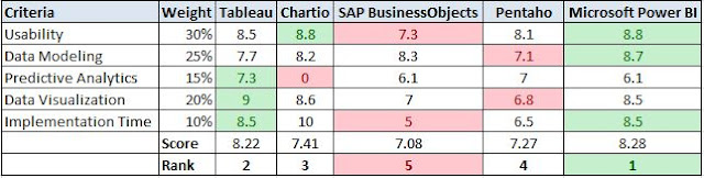
As seen in the comparison chart, Microsoft Power BI barely beats out Tableau. The other three solutions are in the 7.1-7.4 range with SAP in last place.

Conclusion
There are hundreds of options when trying to select an option for a BI solution. The most important thing is that organizations pick the ones that best fit their needs. Microsoft Power BI Ranked first in this comparison and is definitely an option to be considered when choosing a BI solution, but the fact that it hasn't been on the market for very long compared to the rest of the solutions may deter some organizations that are more interested in tried and true solutions. 

***Disclaimer: This comparison is submitted for a grade and the data used to compare the solutions is from user reviews gathered from G2 Crowd and in no way is this meant to be a final recommendation for which BI solution is best. I have not personally tested these solutions against eachother and have scored each solution based on online reviews***