Blog 4, Presentation and Visualization Methods
In
a world where there is an abundance of data, there is an ever increasing need
to be able to represent that data in an easy to understand, actionable format.
In order to best target and service customers, there are many different methods
that businesses can use to help employees and management make informed
decisions about their business. In this blog I will be looking at dashboards
from three different vignettes- sales, accounting, and transportation.
Sales
The following dashboard gives some very useful visualizations. There are planned vs actual sales, sales by region, and top products to name a few. Though this visualization is very useful, it could be made more useful by adding data such as:
The following dashboard gives some very useful visualizations. There are planned vs actual sales, sales by region, and top products to name a few. Though this visualization is very useful, it could be made more useful by adding data such as:
- Top customers by total revenue
- Top customers by product
- Regional planned vs actual sales
- A top salesperson section if the company wants to make a competition
- People are naturally competitve so adding some sort of competition visualization may drive salespeople to sales harder
See
below for an example dashboard from http://blog.jinfonet.com/wp-content/uploads/2014/02/Sales-Dashboard-Example-2.jpg.
The visualization tips mentioned above apply to the dashboard below.

Accounting
A well-functioning accounting department
is crucial to the financial wellbeing of an organization. By creating useful
dashboards for accounting, businesses can leverage the skills of their employees
to a higher extent by presenting them with meaningful data instead of making
them mine it out of reports or a database. The dashboard below has information
such as year to date revenue, account balances, items on order, and revenue vs.
payroll expense to name a few. In addition to the visualizations present in the
example dashboard, the following may want to be considered:
- Current assets
- Current liabilities
- Operating expenses
- Can be broken down by specific time periods(day, week, month, etc.)
Customers with the highest
balances owed
Departments with the highest outstanding
balances
The dashboard below is taken from https://i.ytimg.com/vi/6mwWwzyX_kg/maxresdefault.jpg.
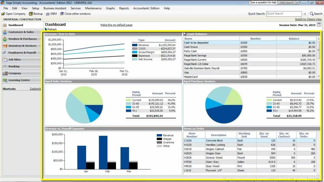

Telecommunications
Last but not least, a
telecommunications company would benefit greatly from a dashboard for its
representatives. There are significant costs associated with running a telecommunications
company and by visualizing their greatest profit and cost areas, an
organization can work to maximize profits and reduce costs. Looking at high
level cost and revenue data, the company can then flow some of the relevant
information down to the sales department but this dashboard is from more of an
operational perspective. Areas of improvement could be:
- Top infrastructure devices by cost
- An electricity usage visualization to help them pinpoint the most inefficient devices in their network
- Average customer support by inquiry type
- Highest profit margins by customer type.
The dashboard below was taken from
http://dashflows.com/ww2/wp-content/uploads/2014/11/CTT-Wireless.png.

Conclusion
Visualizing the data for an
organizational department helps the employees of that department make more
informed decisions about activities in the business. In turn, that helps them
service customers better and give them the best experience possible. Good
dashboards and visualizations allow companies to operate more smoothly and with
the data available in today’s world, it only makes sense to make sense out of
the data.
***This blog was submitted for grade and not to be taken as a professional recommendation***
***This blog was submitted for grade and not to be taken as a professional recommendation***
Business Intelligence is the most reliable tool that combines technology, processes, and people to enable an organization.
ReplyDeleteIt speeds up the ability of organizations to capture, transform and analyze the relevant data points to make faster,
better-informed decisions.How Business Intelligence is driving Digital Transformation